

The end goal of the Computus Engine is to build a web application for the interactive exploration of time. One symptom however, of Long Now thinking, is that I'm not in any hurry to reach the end of the project. I'm enjoying the journey (and the journal for that matter) and I want to do it right, so the project will take as long as it takes.
In fact the irony is this: if I had a time machine I could jump to the end of the project - but I won't have a time machine until I've finished building it.
As I've been thinking a lot about the user experience and the interface lately, and we're already on the subject of time machines, I thought it might be fun to look at their user interfaces. This is the first post in an occasional series that looks at what design or interface inspiration can be drawn from the classic time machines of cinema and television.
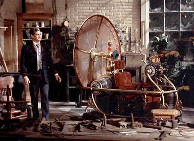
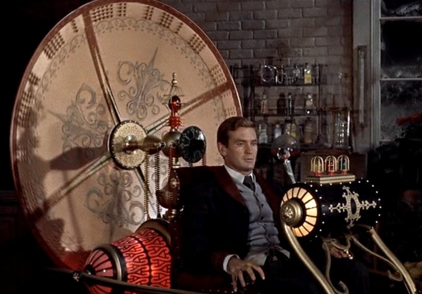
The Time Machine (1960)
User interface: A chair
I can't really go to the H.G. Wells original for visuals so I'm going back to the George Pal movie version. I'm loving the whole brass and wood look here, but I think the most charitable description of the user interface would be "minimal".
The Time Machine (2002)
The machine constructed for the 2002 remake has a little more going on. Stylistically it's a clockpunk update of the original but the special effects and CGI allow for a lot more movement.


