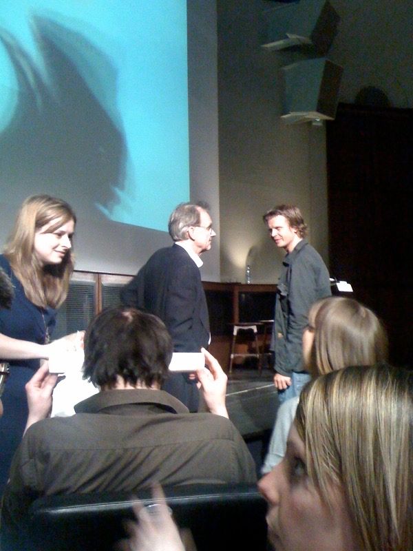
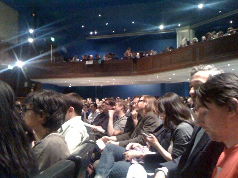
Edward Tufte has been writing about information graphics for over 25 years. His first book, the self published The Visual Display of Quantitative Information is a classic text on information design. On Thursday he visited the Royal Geographical Society to deliver a talk entitled 'Beautiful Evidence'. This also happens to be the title of his most recent book (2006) and in many ways the whole talk felt like a retrospective.
In an article for Wired magazine, Tufte famously demolished Powerpoint. He coined the phrase "chartjunk" to describe it's visually chaotic templated graphs. The smart money therefore was not expecting a Powerpoint presentation. What we got was Keynote on the Mac and a couple of beautifully printed handouts; an A2 facsimile of Minard's classic statistical graphic of Napoleon's Russian campaign, and a series of pages describing Sparklines.
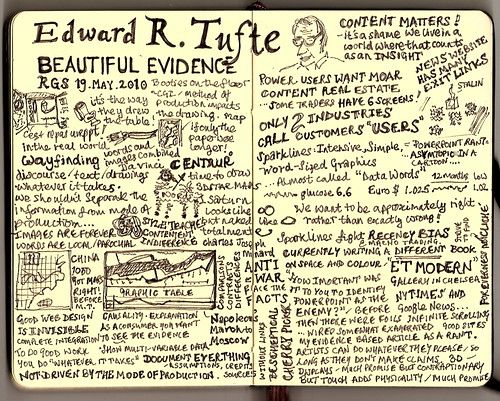
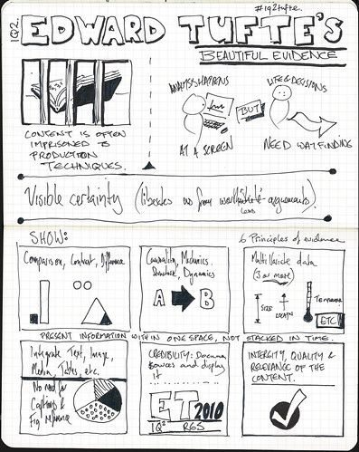
Tufte outlined his grand principles of information display. Simple tenets such as show comparisons, show causality and show multivariate data, were accompanied by examples from historical documents. Information design as a recognised discipline is relatively new, but what I found fascinating was the temporal range of his examples.
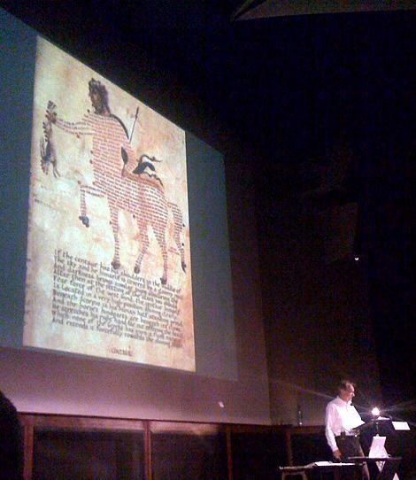
Taking the long view he presented imagery showing the evolution of text and graphics over the last thousand years. The power of inline graphics was neatly demonstrated using a text by Galileo. This was followed by a 9th century manuscript showing the spectacular image of a centaur constructed from Latin text. Really great.
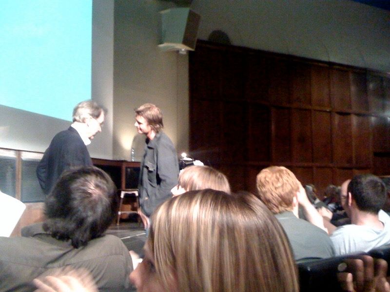
You can catch a flavour of the insight and humour of the man from the clip below.
With a room full of technical creative people it's almost inevitable that the sketch notes on Flickr would be something special. I just love these...