

I've been thinking a lot about the evolution of infographics recently and I've come to the conclusion that somewhere along the line we've been seduced by visualisation at the expense of information. Some recent examples of data visualisation (especially those of the "extreme knitwear" variety) have more in common with generative art. The results are undeniably beautiful but somewhat less than informative.
Prior art
The 'old masters' of visual communication are newspaper infographic artists. They have been communicating complex ideas and articulating the meaning of data for decades - and all without the aid of animation or interactivity. An Infographic is worth 1,000 Words and those of us in the interactive world have a lot to learn from these pioneers.
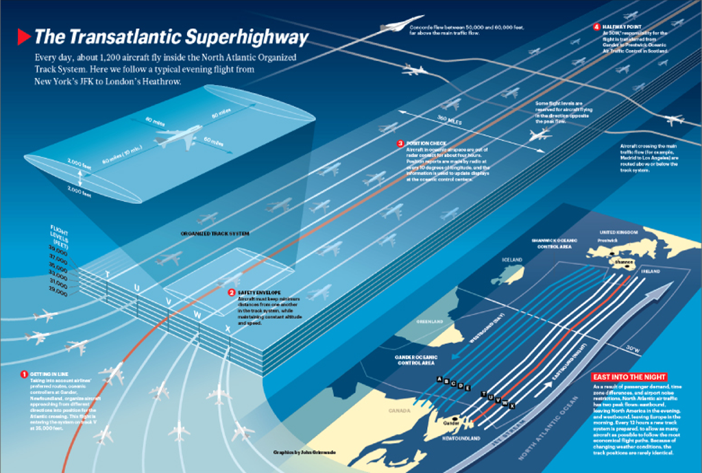
Take the work of John Grimwade for example. His diagrams and maps are clean and clear. He uses contrast and colour (particularly red) to lead your eye to the important details. These and many other techniques are highlighted in this excellent Infographics News article: Ten tips to become an infographics artist.
I've found it hard to find examples of this quality in the interactive space. Two newspapers spring to mind. The New York Times have turned out some excellent pieces as has Spain's El Mundo newspaper. Probably the most complete example of interactive infographics I've come across is for the Peruvian Wharf development in London. That project started out as a CDROM and was later transferred to the web. This crossover seems tailor made for Flash: It is an animation package by heritage, it supports video and has a powerful scripting language. So where are all the sites?


