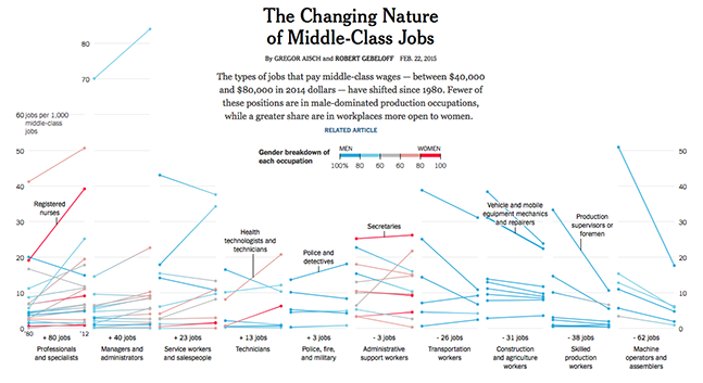
I've commented on this before but I think online designers are spoiled. For all our superpowers (animation, interactivity, connectedness etc) we rarely produce work that communicates information as well as a good newspaper infographic.
As Flash developers/designers we know how to create an immerse experience that will engage the user. That's a given. We're only now learning how to extract meaning from raw data and then communicate those insights effectively to the user.
It's no surprise then that the best interactive infographics work is coming out of the interactive departments of traditional newspapers. A few years ago the New York Times amalgamated their graphics and online department and the results of this crossover have been spectacular.


