September is always a busy month for the digirati of Brighton. The popular dConstruct and Flash On The Beach conferences have traditionally fallen then and they have attracted a number of fringe events. This year everything has been brought together under the banner of the Brighton Digital Festival.
There was in fact so much going on that you could have attended something every day. In my past life as an employee I would have started negotiating a few months before just to get along to FOTB but this year though I'm footloose and freelance, so I made a point of getting to Brighton as often as I could. Here are a few of the events I managed to attend...
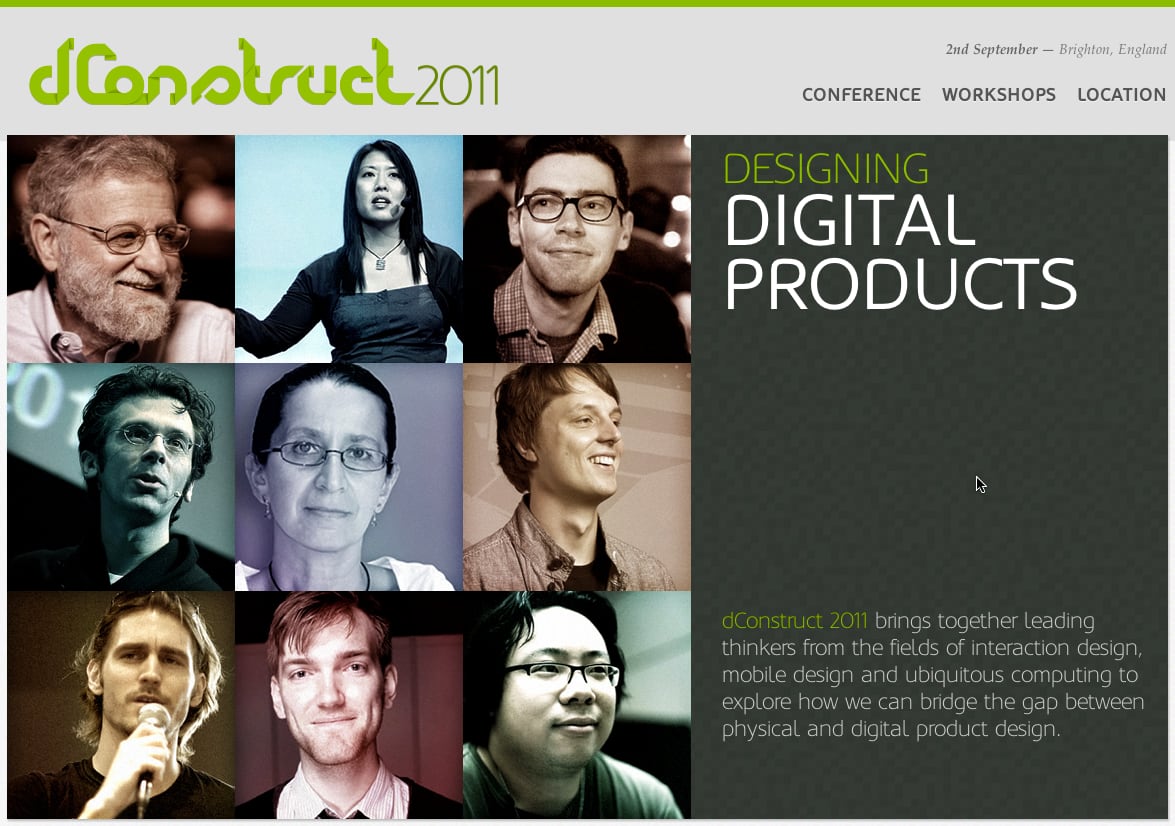
The first event on my list was ClearLeft's long running dConstruct conference. The speakers in previous years have always gotten my attention so this year I made a point of getting along. This is a one day conference with a cerebral tone. There's very little content of a technical nature - that seems reserved for the accompanying workshops. dConstruct is a day of ideas, strategy and dare-I-say-it "thought leadership".
Don Norman is a usability consultant and the author of 'The Design of Everyday Things'. He is also half of the Nielsen Norman Group. The other half, Jakob Nielsen, will no doubt be familiar to Flash developers of a certain age. But let's not go there. Don is short, sprightly and sports a wizened tufty grey beard. I liked him straight away.
Don began with a look at business models and the importance of having a platform that integrates with people's lives. Taking Google as an example he made the profound point that you are not a customer of Google. Google makes it's money from advertising. Advertisers are the customers of Google and you are the product. This of course applies equally to Facebook, Yahoo or any other free service. The price of free is your privacy.
Moving onto applications he recapped the lifecycle of user expectation. In the beginning it was sufficient if an application just worked. It didn't matter how horrible the interface was, you could acquire customers if your app solved a need. When several apps solve the same need then the next point of differentiation is Usability Design. If you're app is easier to use than your competitors then this is an advantage. The next step in the arms race has been Experience Design, where the intention is to provide not just an easier experience but an enjoyable one. Extrapolating this forward he notes that the memories of a good experience are more important than the experience itself and the next step is "We [developers] should be designing memories". He then explored this idea and a few of his observations chimed with my own. He urged us to "...consider the temporal dimension." and observed that "One thing we haven't thought about is how time unfolds in applications". This was great stuff.
A good few years ago I picked up a fantastic book by New Riders called Web Re-Design. Unlike a lot of books from that period it hasn't dated a whole lot since it was printed. I still dip into it today. The co-author was Kelly Goto and in her session she took up where Don Norman left off and spoke about mapping emotion to experience. A few of the points that interested me were her ideas on connectedness, "Think about the space in-between things." and the importance of understanding the rituals of people's lives. Taking the idea of context a step further she aked us to "...understand the mood people are in when they use your product."
Following Kelly were Bryan and Stephanie Ryger. They took turns to speak and although the content was good it didn't get me as excited as the first two speakers. Two points they made did strike a chord though. Firstly that the rapid pace of technology change is creating generation gaps, and secondly that it's important to empower authorship in your users. This second point was echoed a few days later in Carlos Ulloa's talk at Flash On The Beach.
I had high expectations for Craig Mod's session on the shape of the future book but in the end I was disappointed. I'm a big fan of Flipboard. Their app takes some pretty ugly data (RSS, Facebook updates and tweets) and presents it in a gloriously stylish way. I think I was probably expecting a more technical session. What he delivered was largely metaphor and storytelling. I know from speaking to people at lunch that this session polarised the crowd. For me it wasn't what I expected and it left me disappointed.
Having not been to dConstruct before I was surprised and delighted to run into so many friends from other events. I caught up with locals from Brighton, a few people from History Hack Day and even a few guys from the local WorthingThing meetup. Consequently lunch was rather overlong and we missed the first post-lunch speaker. What I caught looked great, but such is the way of these things. I will have to catch up on the video.
The last speaker I have notes for was Matthew Sheret, Data Griot at LastFM. We last ran into each other at History Hack Day when he gave an impassioned talk about Dr Who. This seems to be a recurring theme as the good doctor made an appearance in this session as well. Given my own preoccupation with time this was right up my street. He covered synchronised time, "Service Avatars" and the notion that ancient cave paintings are like really slow Instagrams. Also, when discussing the idea of totems he quoted Tom Armitage, a name that would recur again and again in the next few days.
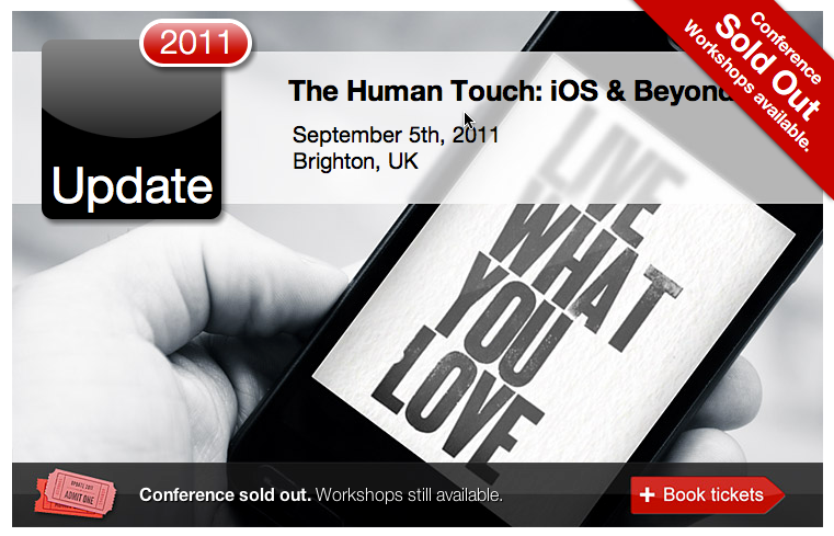
Aral Balkan's one day conference on user experience was next on my festival list. The first speaker was Matt Gemmell, or should I say Evil Matt Gemmell. Adopting his 'evil' persona Matt gave us a nice twist on the usual usability conventions. This included such gems as "More is better", "Be Useless" and "Celebrate Stupidity".
Jeremy Keith, still fresh from hosting dConstruct a few days earlier, was our next speaker. In a conference filled with platform evangelists it was refreshing to hear Jeremy's impassioned defence of the web as a platform - "you don't need permission to work on the web". He railed against closed platforms as it angered him to see so much time and talent poured into 'black boxes' that won't endure. This notion of durability comes back again and again in his talks (he often cites Long Now ideas) and whilst I don't always agree with some of his arguments I admire his holistic way of thinking.
In probably the most hands-on session of the day Seb Lee Delisle took us through how to build an Angry Birds style game using the Corona SDK. Programming with Corona is done with Lua, a simple scripting language that's pretty easy to pick up. Seb introduced the concepts and the language and was able to turn out a playable game in about 30 mins. This was the first time I'd used Corona but it's very quick to pick up and the execution speed on the device is equally fast. I'd definitely consider it for any iOS work in the future.
Another favourite speaker from the day was the stylish Joachim Bondo. He is probably best known as the developer of the iOS Chess game, Deep Green. Joachim is a self confessed watch fanatic. In a presentation I strongly identified with he drew parallels between watchmaking and software development. Taking the premise that "watchmakers create magic every day", he urged developers to understate and over deliver. Quality takes time but "users flock to a great project".
There were a lot of great sessions at Update but one that really stuck with me was from the youngest speaker of the day, Anna Debenham. In a meticulously well researched and confident talk she outlined the disastrous state of ICT education in Britain. A horrified crowd listened to examples of children being shown to build websites using Microsoft Word and Powerpoint. Given that the best defence is offence, she called on the crowd to educate your children. Teach them to program using websites like hackasaurus and software like the marvellous scratch.mit.edu.
Guest of honour was Ronald Wayne, artisan, maker, illustrator and the third founder of Apple Computers. Ronald was in his forties when he first met Steve Jobs. The two of them were working together at Atari. When Jobs and Wozniak founded Apple, they asked Wayne to draw up the contract. A skilled illustrator, he also sketched the first Apple logo. Wayne has been a hacker and maker his entire life. He spent much of his earlier career working on designs for slot machines. He also spoke of designs he had for a roll-top wooden screen cover for the early Apple computers. This was a delightful and fascinating interview with a man who was there at the birth of personal computing.
Our last speaker of the day was Cennydd Bowles who called for future products to be more humanised. We should be tackling "wicked" (i.e non-trivial) problems and considering how the offering is delivered both digitally and physically. This last point really interests me. I have a company I may be working with next year who have both a physical and digital product. The crossover between those spaces is full of potential.
Flash On The Beach
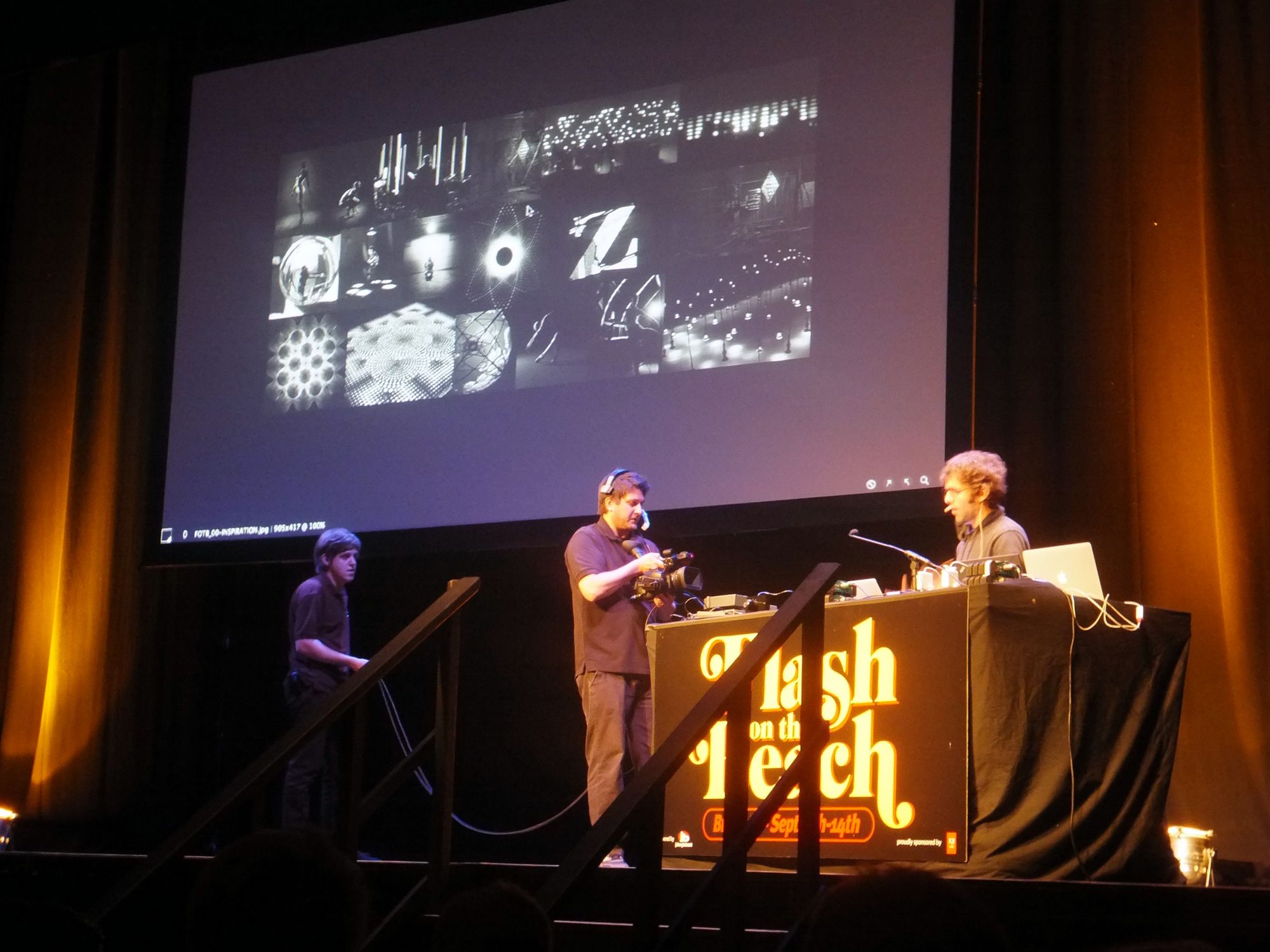
I'm not going to cover the individual sessions for FOTB but if you're interested you can read Jens and my coverage over at FlashMagazine. With three days of three simultaneous streams Flash on the Beach is the largest conference of the festival. This was it's sixth year, and as it would turn out, it's final year - at least by that name. It seems the 'Flash' in the title has been putting some people off from attending. This seems a shame as John has been including speakers from other disciplines and technologies for many years. I won't get into any of that here but suffice to say that the conference will be around again next year with a new name, and as a shorter two day event (plus the usual one day of workshops). I'm sure it's reputation will continue as the most inspirational event of the festival.
Digital Open Studio: CogApp & Nixon McKinness
There are a number of great agencies and studios in Brighton; it's a very creative town. Two companies I've had on my radar for some time are CogApp and Nixon McKinness. I like them both and for different reasons. CogApp has done some great work with museums including my spiritual home the RGO and National Maritime Museum. Nixon McKinness on the other hand are interesting because of their almost socialist company structure and focus on happiness as a metric for success.
It turns out that both companies are now based in the same building in Brighton and they held two combined open days during the festival. The second event, themed around maps, looked the most interesting to me.
The event was well attended; I counted between thirty and forty people. Slightly more female than male, but a good mix - I met copywriters, students and developers. We were all asked to draw from memory a map of how to reach the hospital in Brighton. All I could remember was that it's on a hill somewhere near Kemptown. I'd once lugged a massive backpack up that hill when we stayed for FOTB a few years before.
After a brief introduction about each company Matt Matheson from Nixon McKinness spoke about the joy of handmade maps. When you make a map for someone, the features you choose to add or omit, imbue it with some of your personality. He gave an example of a map he'd been given by a friend whilst in Canada. Handmade maps are rarely geographically accurate but they contain elements that are important both to the artist themselves and to the receiver. Details they know would be of interest to you.
With this premise in mind he proceeded to dissect the personalities of the attendees hand drawn maps. Some elements remained constant throughout (the sea, certain roads), but each had little touches that revealed something about the artist's lives or their personalities. Maps marked with the train station were made by people who travel by rail. Roads were marked by people who travel by car. My map had the Brighton Clock tower (because I'm a clock geek) and the crazy hill because I remember that climb. A very enjoyable and enlightening session.
CogApp's presentation was a demonstration of the deep zoom interface they created for the British Library's Magnificent Maps Exhibition earlier in the year. The challenge was how to encourage visitors to study the detail within these ancient maps. Their solution was to scan the maps at ultra high resolution and project these onto a table. Then, by use of a custom built pointing device (shaped like a magnifying glass) the user could zoom into key points on the map to see enlarged detail. This was all accompanied by narrative audio.
Cogapp open studios - Magnificent Maps
Being of a nerdy disposition I was keen to know how this was all done. I had expected OpenFrameworks but was surprised to find it was developed as a Mac app in Cocoa. The magnifying glass contained a number of infrared transmitters arrayed in a circle. These were picked up by an overhead camera and the results fed to the app. A little bit of CV blob detection on the images returns the controller position and this is used to drive the display.
It's clean and it works really well. I particularly liked the simplicity of the interface. The magnifying glass looks like a real world version of the zoom icon in Photoshop. It's the only interface element so the visitors discover the functionality very quickly through play. Loved this.
QR Treasure Hunt

This seemed like a good idea. My wife and I love a good treasure hunt. We used to do them all the time in London. This time though I think we overestimated what could be achieved on a busy Saturday afternoon with a buggy and two kids in tow. Brighton was very busy and negotiating the lower lanes was a bit of a nightmare. Also hitting thirteen locations in an hour seemed unrealistically short. Considering each location had to be found, the QR code scanned and a further question solved. I wouldn’t have minded so much if it hadn’t been advertised as family-friendly. Sadly, this one was a bit of a blow out.

